.svg)
.svg)


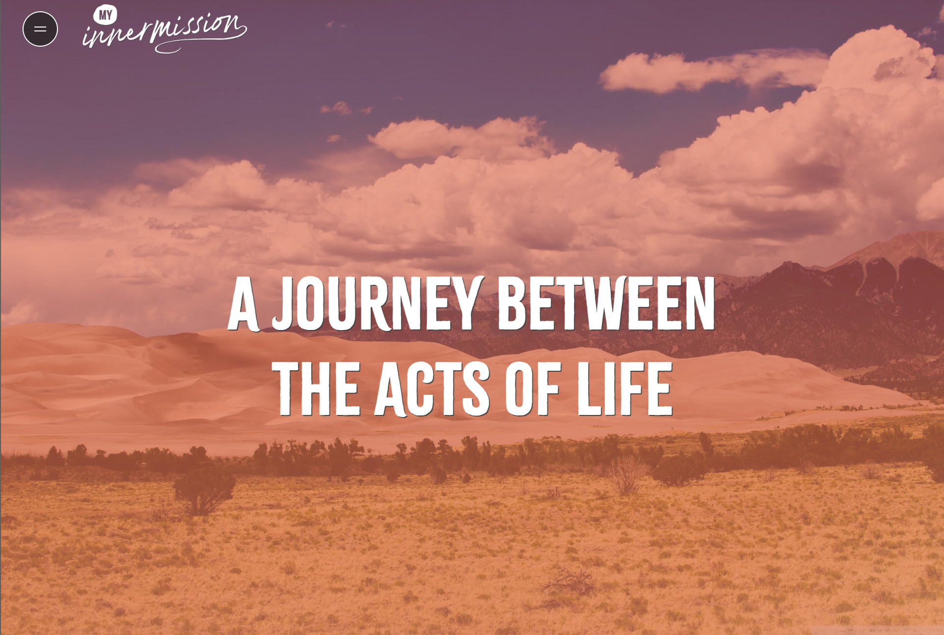
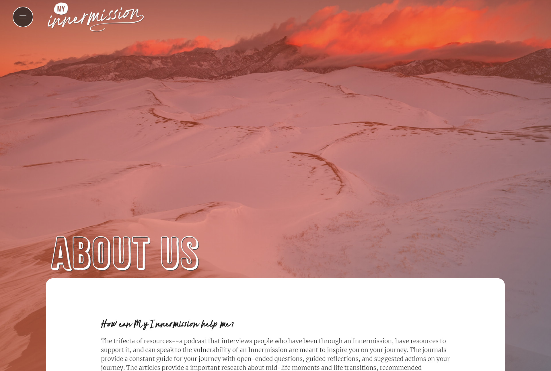
y Innermission was a very rough idea in it's creator's mind when Colleen came to us looking to develop a platform for articles and podcasts. This was seen as a boon because it allowed us to design liberally and give her logo and some notes we took, it's own unique home online with a powerful online presence. We were able to take her vision and create something she would be proud of that is also versatile and easily adaptable. Originally designed to be a digital product eCommerce store, we decided to instead to direct the site to Etsy for all physical goods while the digital goods were being developed.
Many people think websites should resemble power-points or word documents, but with a bit of artistic flair, they can contain much more life than those limiting comparisons.
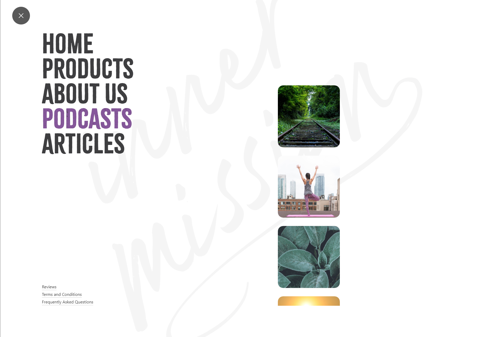
We recommended the podcasts be hosted off-site to allow for faster speeds. For most large media, we advise our clients to seek third-parties for hosting. Vimeo for videos and Spotify/ Apple Music for podcasts or music. This is to allow platforms specifically designed for hosting these types of media to do what they do best while being seamlessly integrated into the website. The visitors to the site will never know, but it the result is a much more streamlined website only hosting what it needs to.

Developer Notes:
When Colleen told us we could build it however we saw fit as long as podcasts, products and articles were the focus we ran wild. The colors are all given to use by the logo designer, but the shapes, orientation and large text were inspired by a yogurt website we thought was fun, believe it or not! The website was originally intended to sell digital content, but has since been converted away from eCommerce despite still having the ability to switch back at any time. Now Esty accepts all physical items which allowed us to focus more on the content side of things rather than funnel customers to immediately buy product.
The orientation of the pages is super unique, allowing for the visitor to see the background and gradient the entire time they scroll. We also hide titles behind the content boxes for a cool parallax effect. Finally the menu was intended to be opposite of the cart button, but when things we changed we just expanded the menu's capabilities and gave it a larger than life design taking up the entire screen. For businesses and organizations willing to break free form the professional/corporate mold, ideas like this menu can come forth without us feeling like they are too eccentric. The more engaging a website can be, the more memorable for those visiting.
This website is so much fun! ESO-EXO is such an easy company to work with. They made the entire development process so smooth that it made me question all of my previous false-starts at building a website. Glad I didn't try to do it myself on Wix. These guys will give you a new opinion of website companies.
Colleen Stanevich, Owner